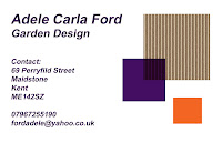
I came up with a few and presented them all, but I'm not convinced that my tutor was at all happy with them- which is fine but i would like to get this write- its important to have my personality, my image on the card so that it is distinctly mine-
these ,made of recycled cardboard were to show- eco and sustainable thinking
but they lack something,
bright, young and happy = me
but look too much like a florist card!
Here is the matching letter head:
Clean , simple- a touch of colour to show vibrancy and youth,
with the eco square, royal purple to contrast with the young orange
This is the one i have chosen , for now at least,,,
Here is the matching letter head:


No comments:
Post a Comment